As I'm working today on editing and creating my documentary's poster, I realized I never updated you all on how shooting for this went. I took the pictures in school Thursday as I had said, and although I'm happy with the results, they are a bit different than I planned. Before I show you the final image I'm currently editing and manipulated, I wanted to do a kind of spot the difference and just reflect on what I said I was planning to do vs. what actually ended up happening.
The plan:
- Utilize blue, purple, and white lighting
- Have silhouettes formed by the back light, in other words, just have black figures as my performers
- Use of solid black for stage floor
The result:
- Utilization of pink lights and bright white spotlights in order to create the "silhouettes"
As it turns out, although I have spent endless hours throughout the years on and in my schools stage and auditorium, I am one hundred percent a performer and not a backstage technician. I completely overestimated the lights we had and the ways I could manipulate them. The blue and purple lights were originally inspired by an image I took in the wings of Morsani Hall in the Straz Center- a theater primarily used by professional touring companies and performers. The blue and purple lights I wanted to recreate, I was trying to do so in my public high school's amateur theater. We did have these colored lights, they just didn't really read well and were not as bright and powerful as I remembered, so, I opted for a pink tint in lighting which is just what ended up working best.
 |
The ceiling of the stage where the blue lights were located.
They're clearly there, just didn't do much for the shot. |
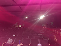 |
The pink lights were located in a manner where they
more faced the stage rather than came down
right on it. You can see the pink was capable of totally
taking over the auditorium. |
- The "silhouettes" are actually completely visible colored bodies
Again, an misunderstanding of the placement of the lights in my theater. The colored lights, like I said, were not bright enough and faced directly down on the stage, not able to give me the silhouette effect. The only way I could get the effect of shine and light falling on the performers was by using spotlights, which although got the job done, created a different look than I anticipated. Because of this, you can see the performers clothes perfectly; and because I didn't plan on this happening, I didn't tell my subjects to wear anything specific. Now, this could have been awful and ruined my entire picture, however, I think it actually worked in my benefit. All of my troupe-mates that volunteered to be in this picture for me were conveniently wearing solid colored shirts that worked well together, giving the shot a nice bit of color, but nothing too crazy.
- The part of the stage I shot on is actually wood, but I didn't even end up capturing it in some shots.
This one is actually up in the air; it could go as planned, but also maybe not (I'm making two versions of the poster right now to decide which is best later.) Originally I had planned to have my actors stand on a black stage, which is what I thought the stage I would be using was, and I mean, it was, but not the mantel, which is where my subjects had to stand for the picture to work with the lights. If I use the image that shows the wooden, unfortunately not black, stage, this means I have to crop my "6510" title and get rid of the background to be able to use it on my poster (since the background of this picture is black). If I use the image that doesn't even show the stage, I may just end up putting black at the bottom of it and easily pasting the picture over it. But this will all be decided with the final result.
Anyway, enough explanation. I'll just show you the two pictures I'm using for my poster. I guess the one I will actually end up using for the poster will be a surprise, but for now, I think I'm leaning towards the second.


No comments:
Post a Comment